Our key focus is to build positive experiences for students through self-actualization programs enabling them to grow up to excel socially, emotionally and professionally in an interdependent and complex world. KSCESC works to inculcate core human values and spirit in our youth, enabling them to achieve, and lead with wisdom, forethought, and compassion. The intent of our endeavour is that the learning absorbed by our pupils manifests in their everyday actions, complemented with a conviction to do the right thing in the right way. The Aavya Foundation
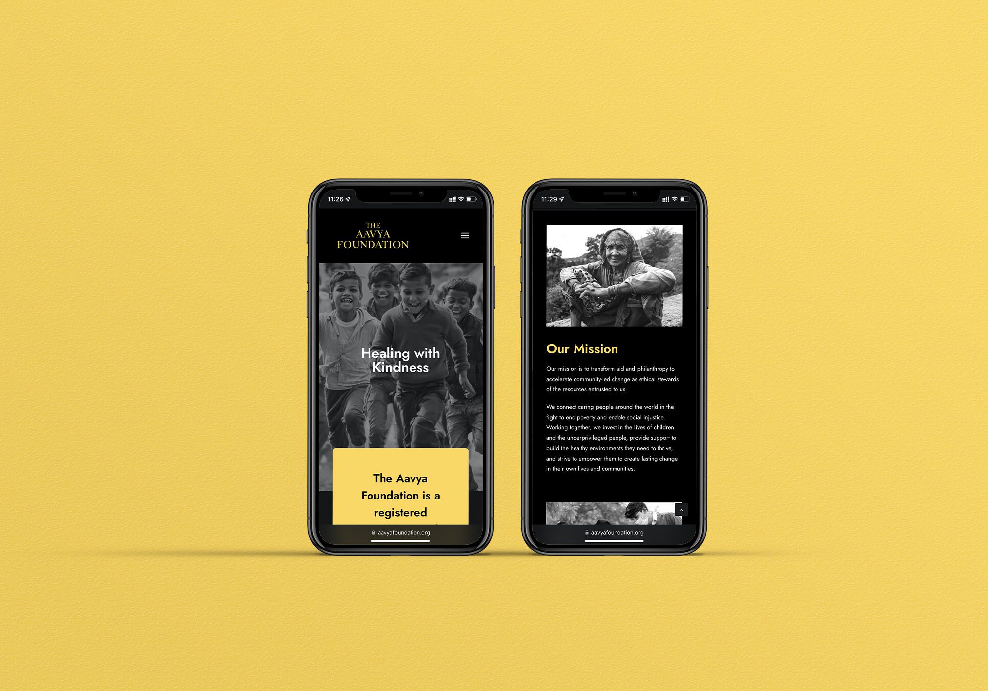
Healing with Kindness
Overview
The Khushboo Singh Centre for Excellence & Social Change has been established with a commitment to deliver value based holistic learning & development to the youth.
Logo & Identity
Print Collaterals
Website Design
Brand
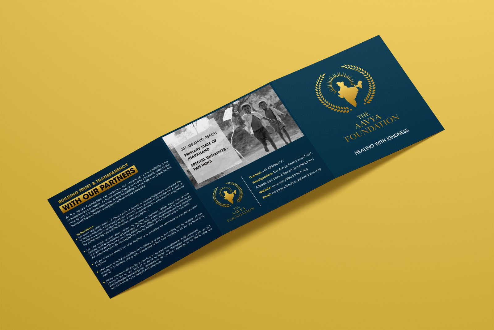
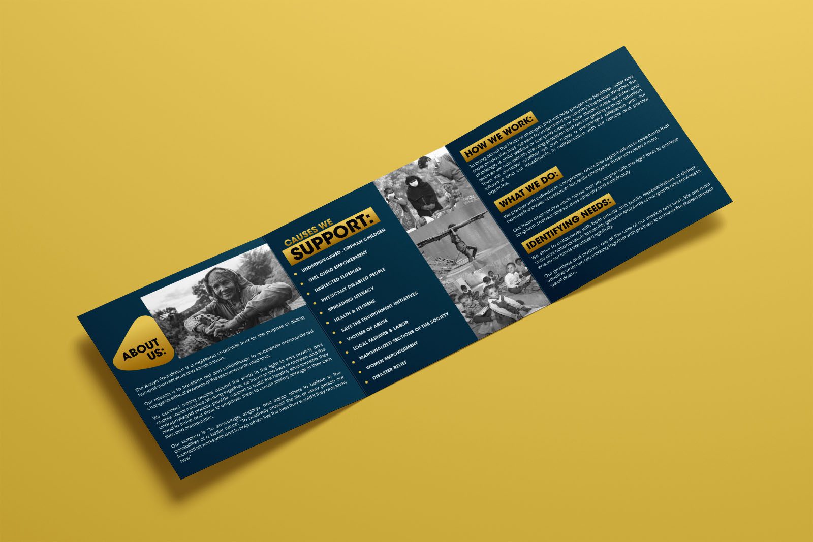
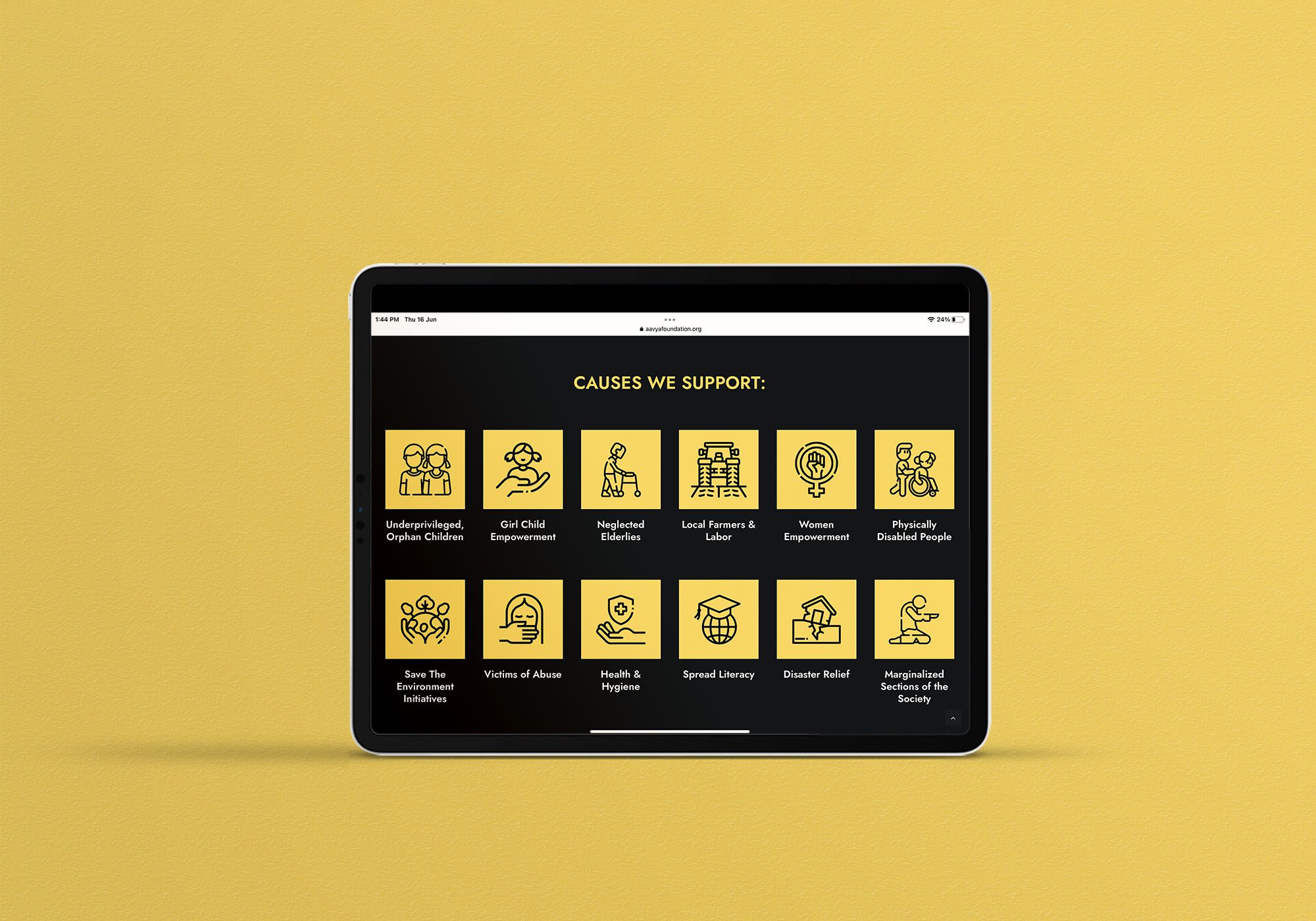
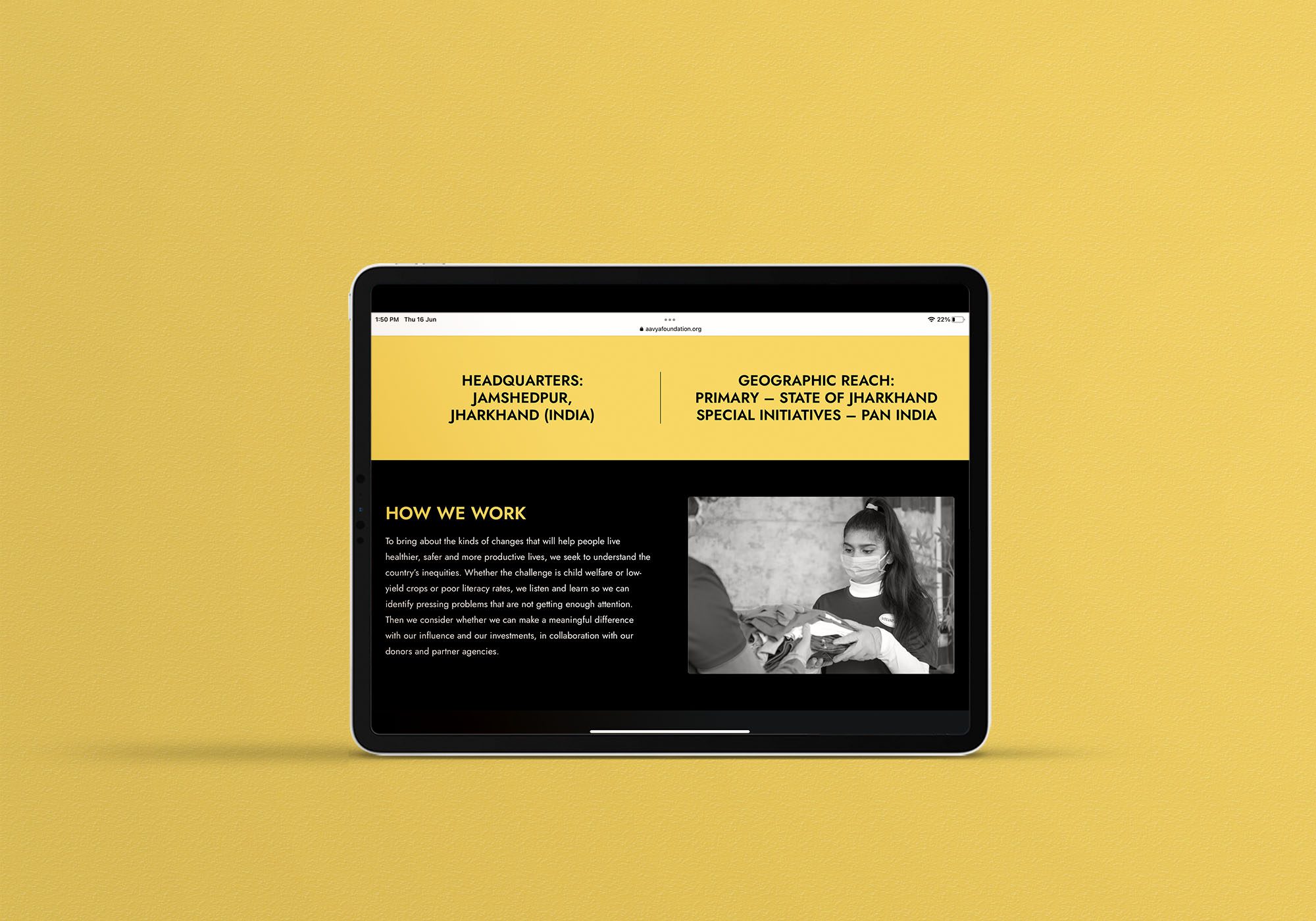
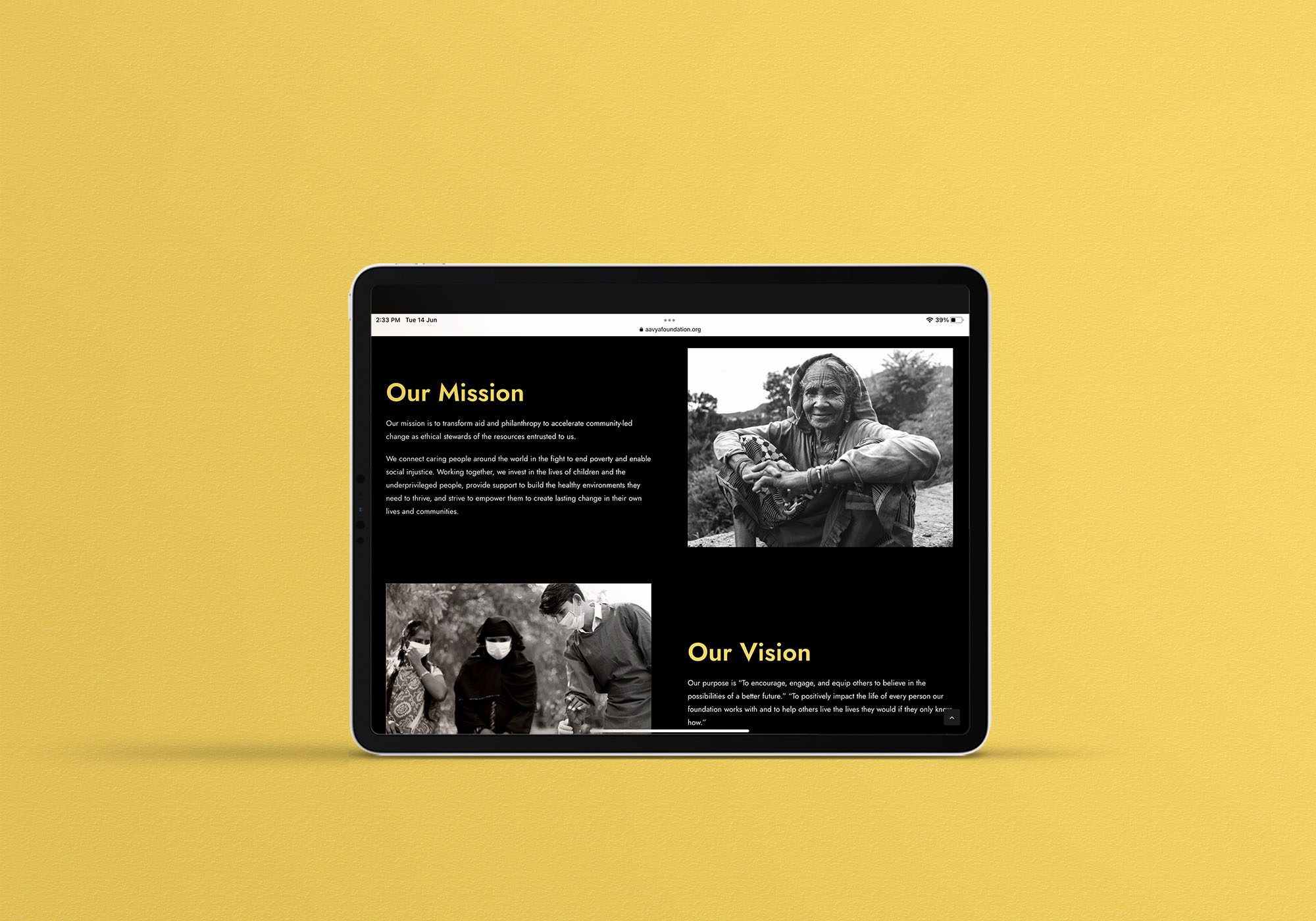
The Aavya Foundation is a registered charitable trust operating out of Sonari location in the Steel City of Jamshedpur. The Foundation is a social-cause driven organization committed to the purpose of aiding humanitarian service. While discussing with the client, we were told that they support education, healthcare, and skill development of the unprivileged sections of the society. Additionally, the Foundation is committed to endorse the abilities and skills of the specially-abled children along with organizing reward and recognition programs to highlight the accomplishments of the children at the School of Hope.
Solution
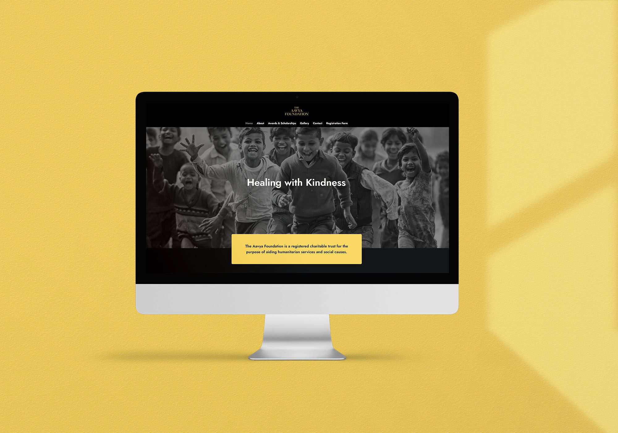
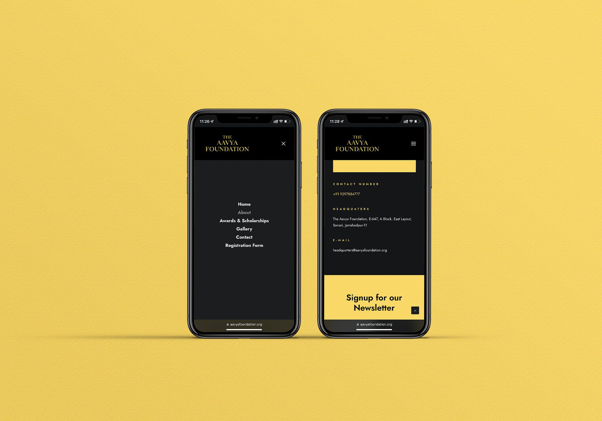
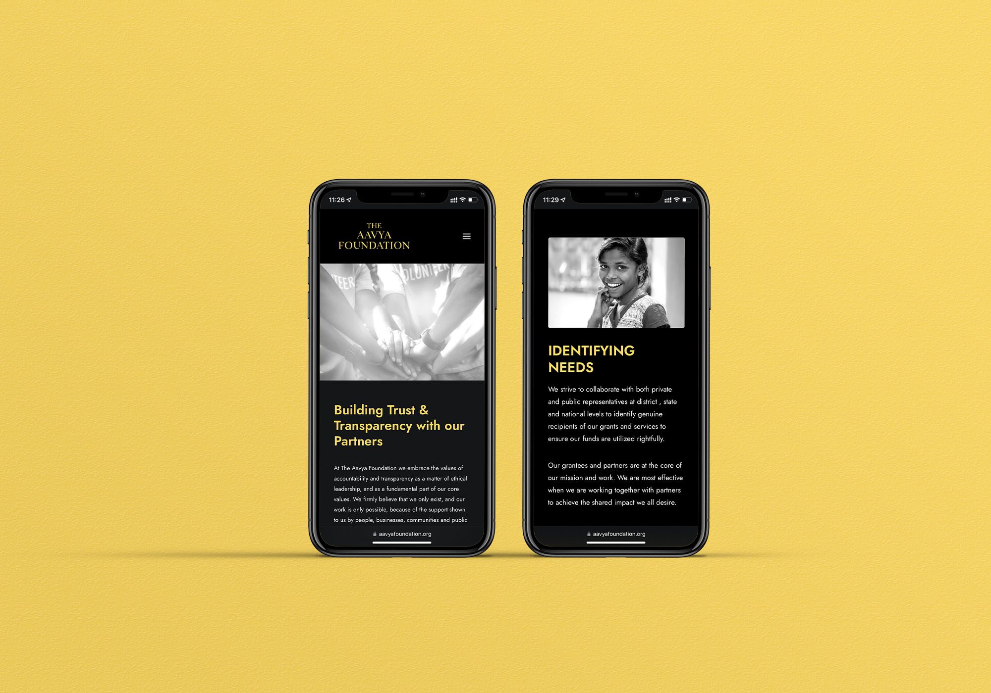
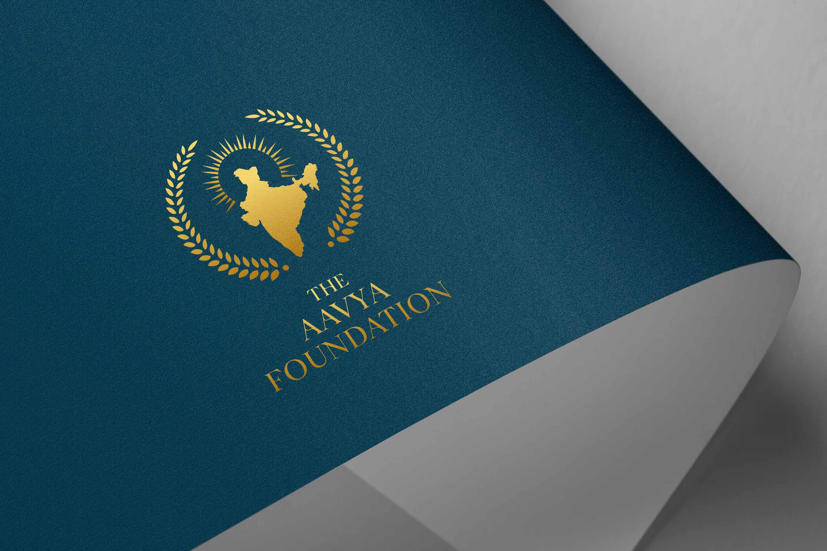
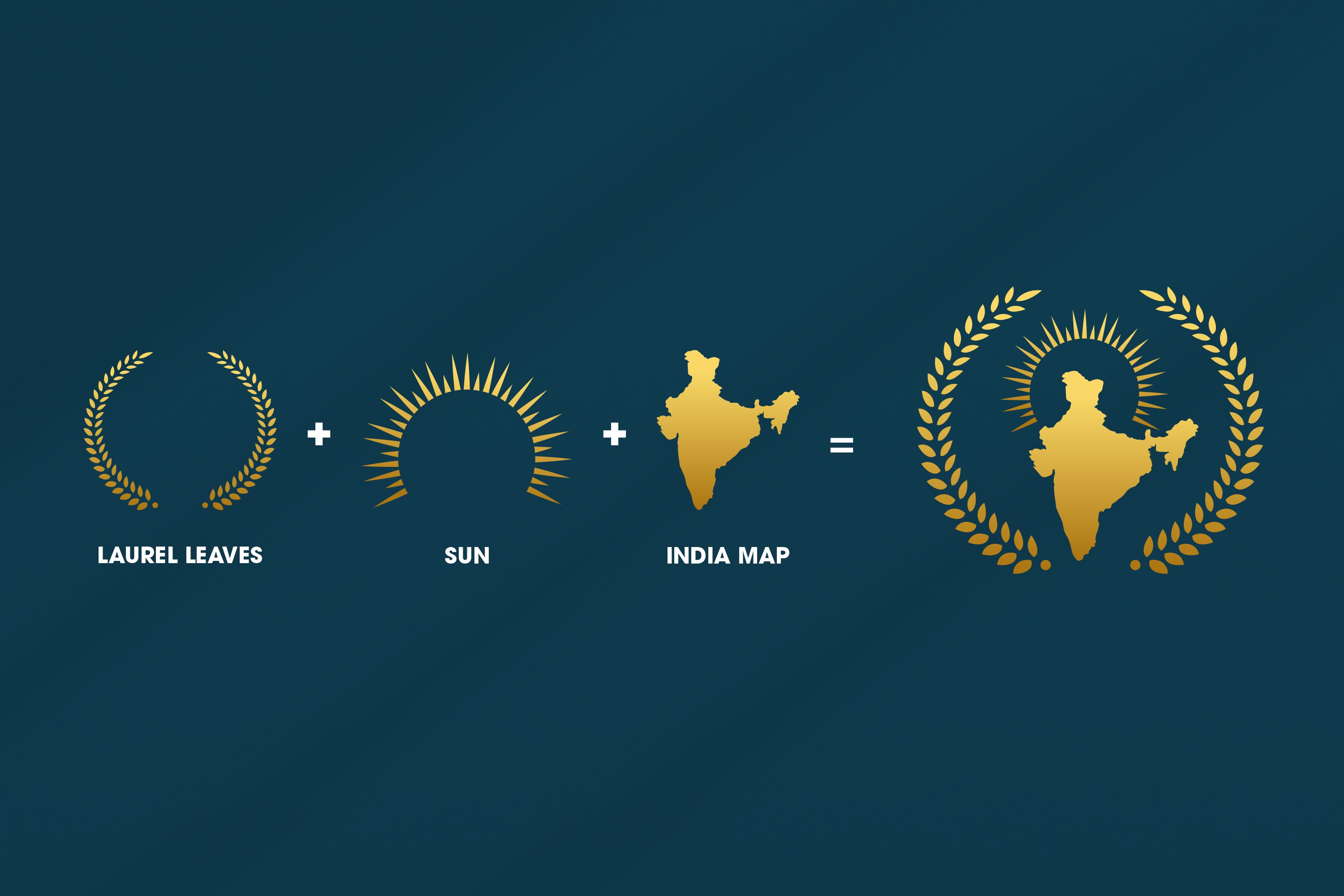
Having understood the brief, we came up with a logo which was resplendent in nature given the vibrant combination of gold and blue having the map of India at the centre with the sun in the background and surrounded by olive branches signifying peace of mind and dynamism which emanate from noble work. The bold and capitalized font of the name complemented the map and olive branches well. This theme was carried forward in the information brochure as well wherein we accommodated the colour white thus creating a suitable background for the colours blue and gold. Black and white pictures of the foundation’s work were used to create a poignant effect. The website has been put with its homepage in black and white with colour gold being used as the background for text in black thus having a telling effect.
Website
The site was re-imagined in order to highlight the process behind Cloe’s production. The same model has been used in every shot to provide a consistent feel. Aspects such as colour edits and a journal were added to further articulate the brand’s story and stimulate sales.
